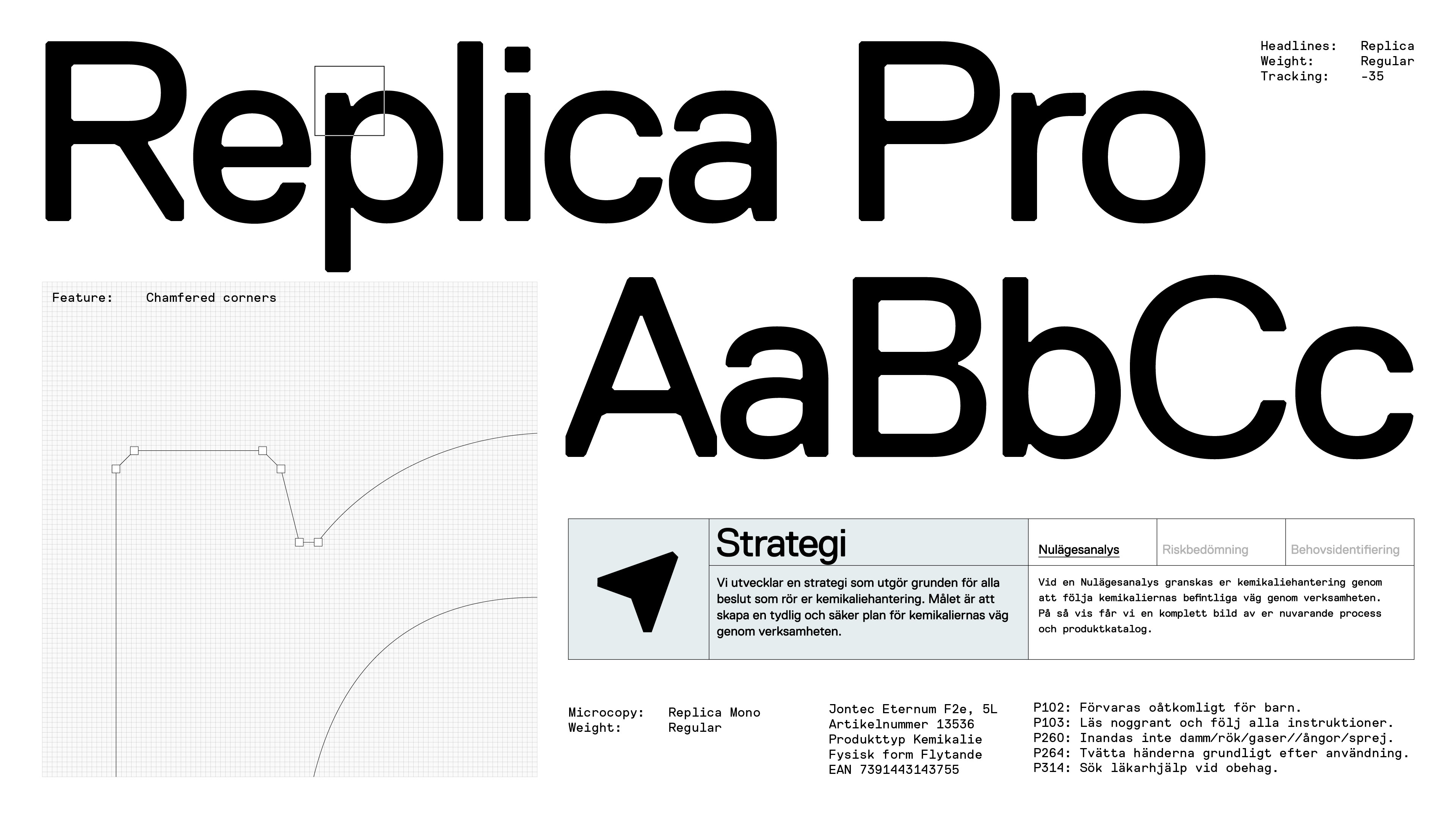
Sharp geometric elements are combined with fine-print infographics to convey a sense of precision. Because when handling chemicals, nothing should be left to chance.


Close up - logotype
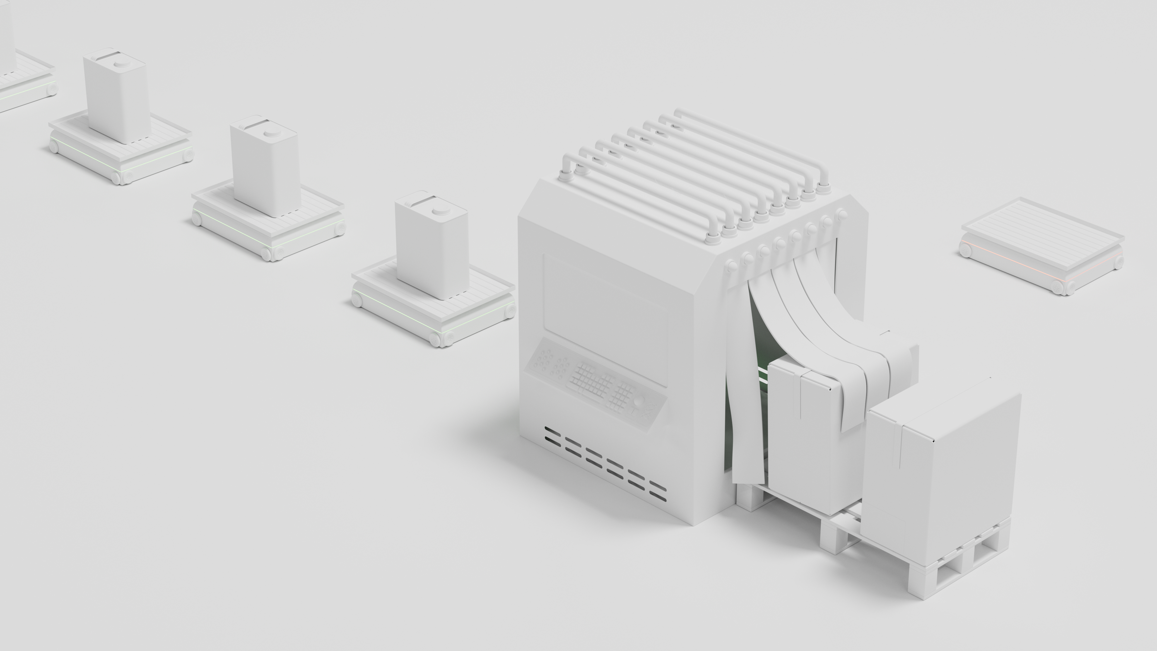
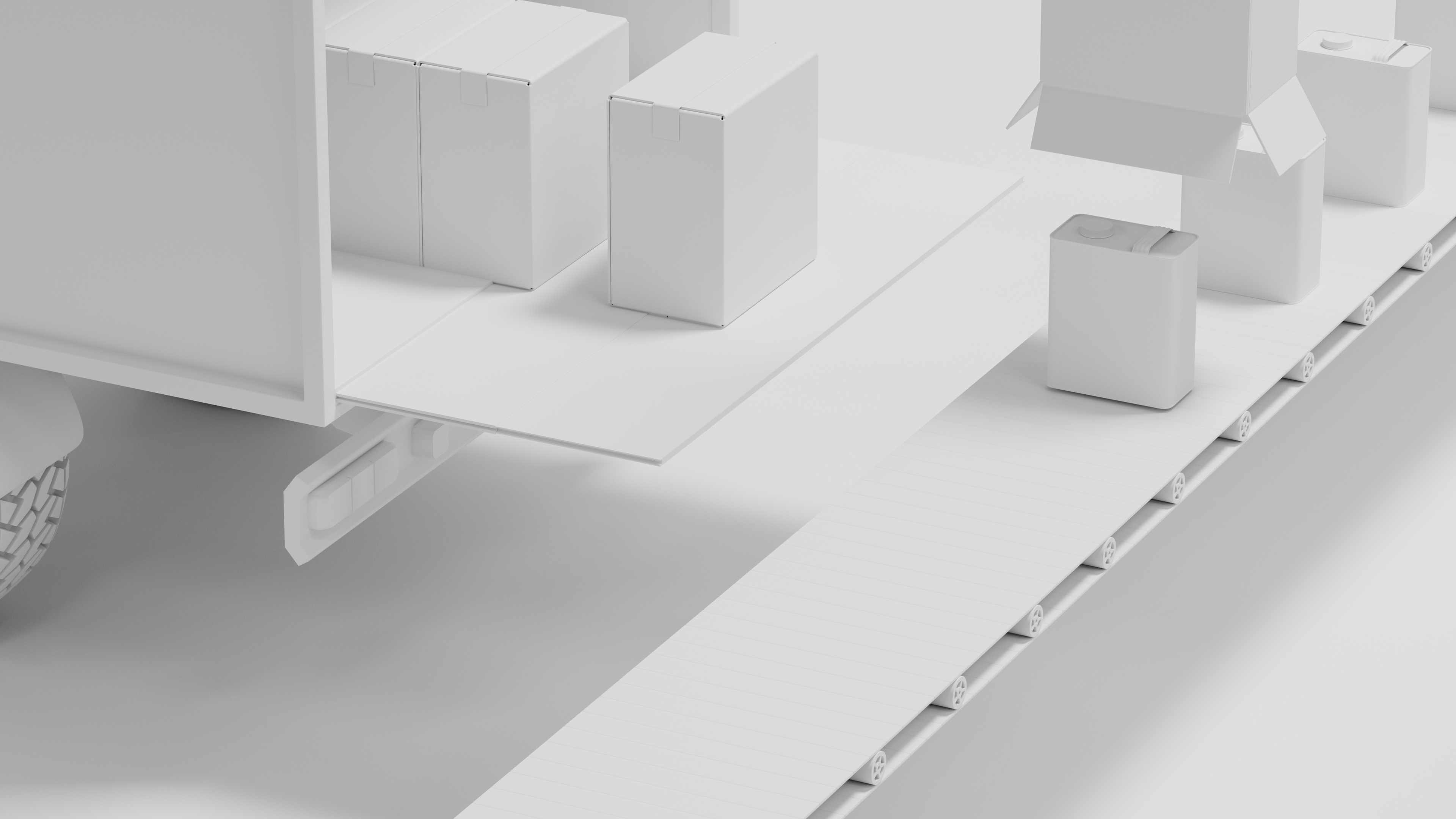
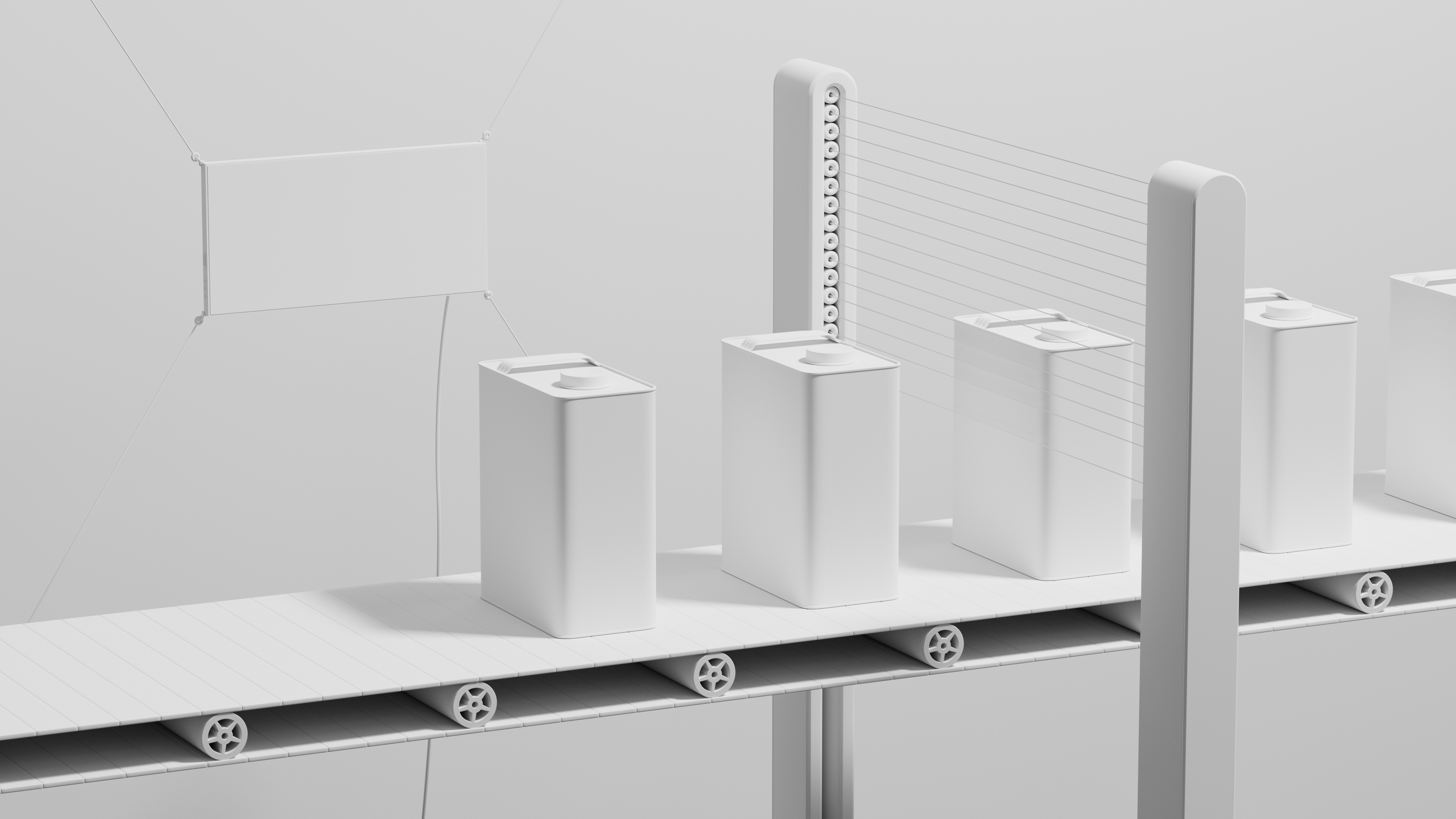
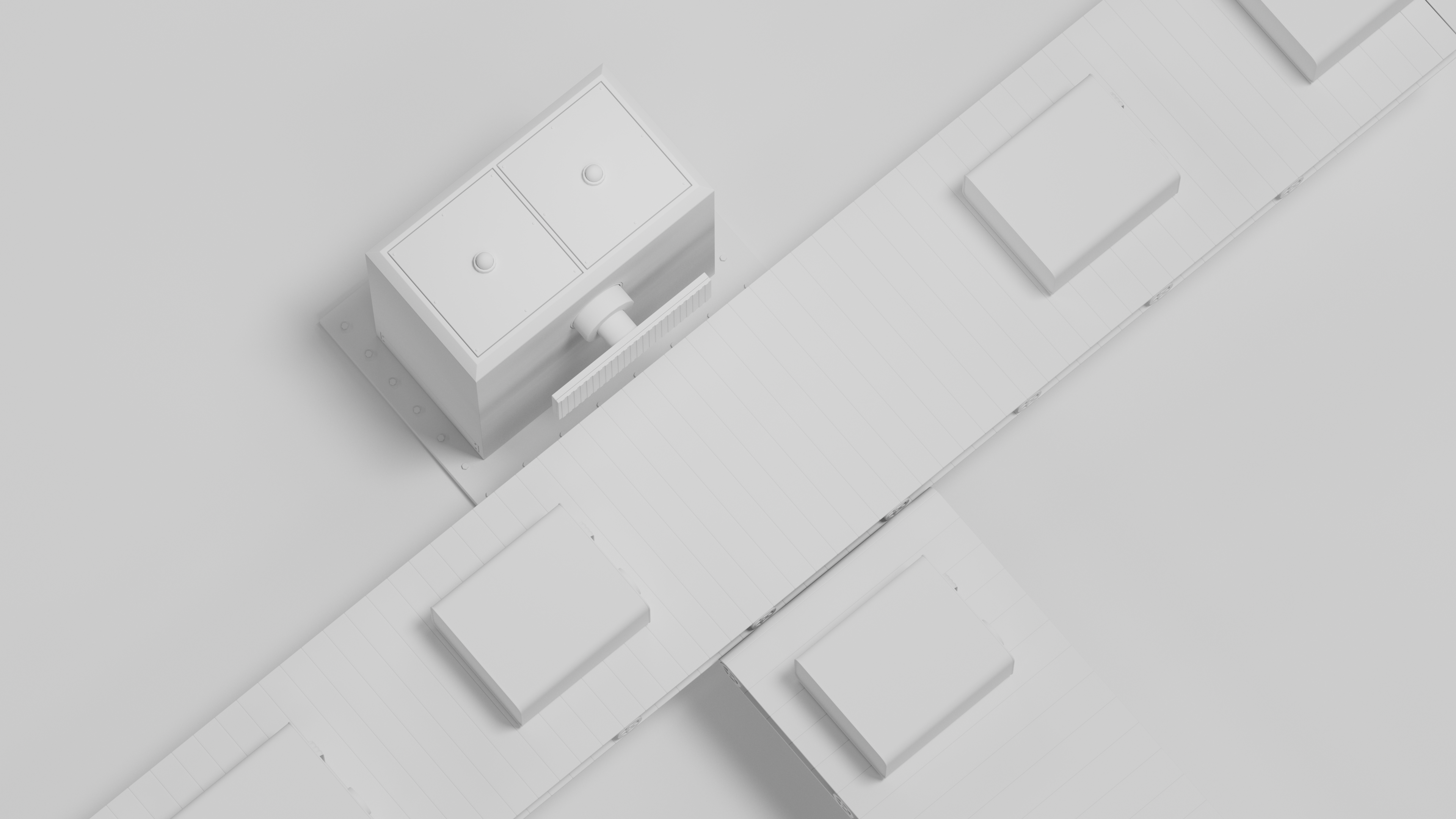
Under the tagline “All inclusive chemical management”, the journey of chemicals was brought to life as a virtual world, where each chemical moves through a continuous flow from analysis to management.
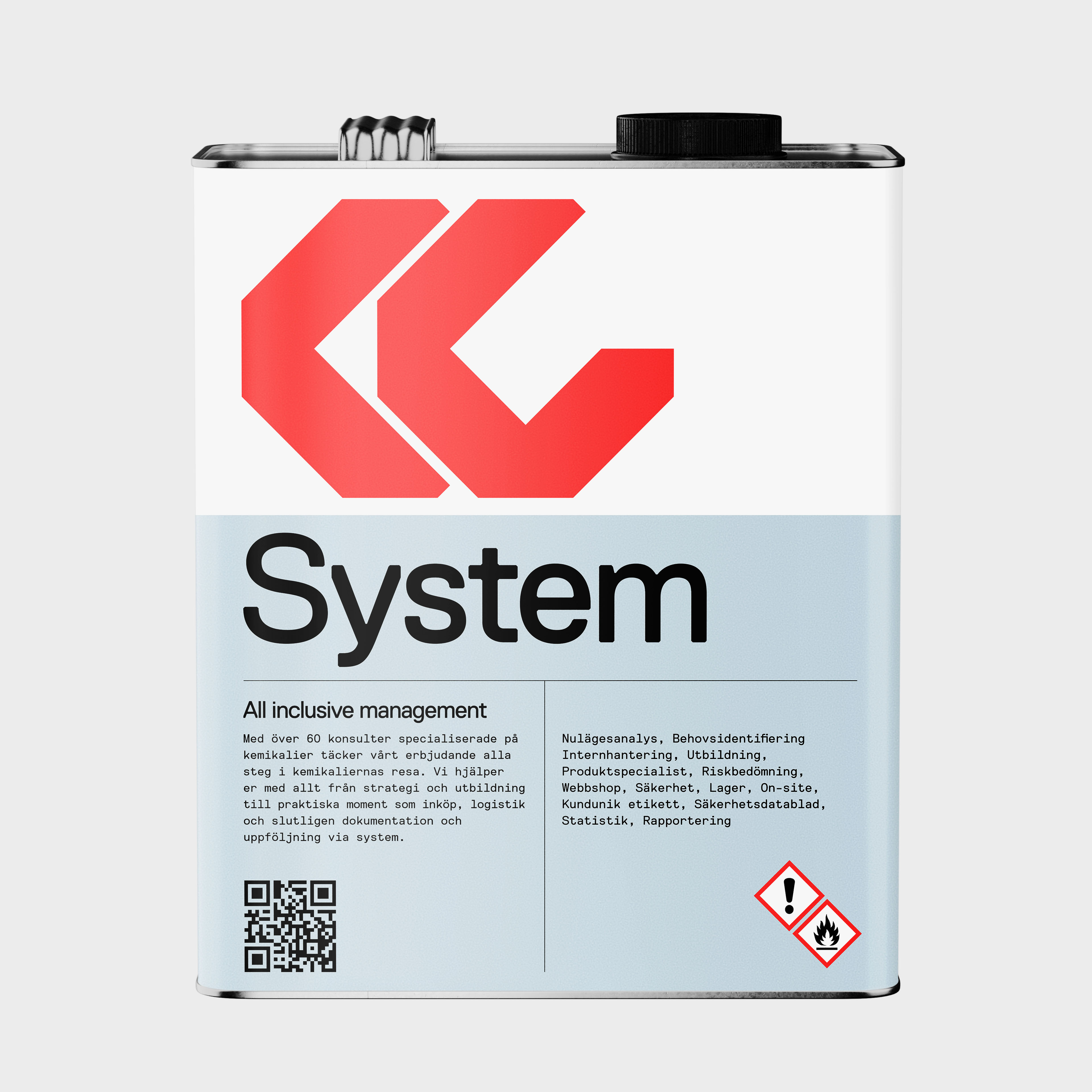

Close up - logotype
A root-like pattern was created with one single line, manually adjusted to resemble a growing and unpredictable pattern of nature.


Close up - logotype
A root-like pattern was created with one single line, manually adjusted to resemble a growing and unpredictable pattern of nature.


Close up - logotype
A root-like pattern was created with one single line, manually adjusted to resemble a growing and unpredictable pattern of nature.
Close up - logotype
A root-like pattern was created with one single line, manually adjusted to resemble a growing and unpredictable pattern of nature.

Close up - logotype
A root-like pattern was created with one single line, manually adjusted to resemble a growing and unpredictable pattern of nature.
Pattern
A root-like pattern was created with one single line, manually adjusted to resemble a growing and unpredictable pattern of nature.

Pattern
A root-like pattern was created with one single line, manually adjusted to resemble a growing and unpredictable pattern of nature.

